Overview:
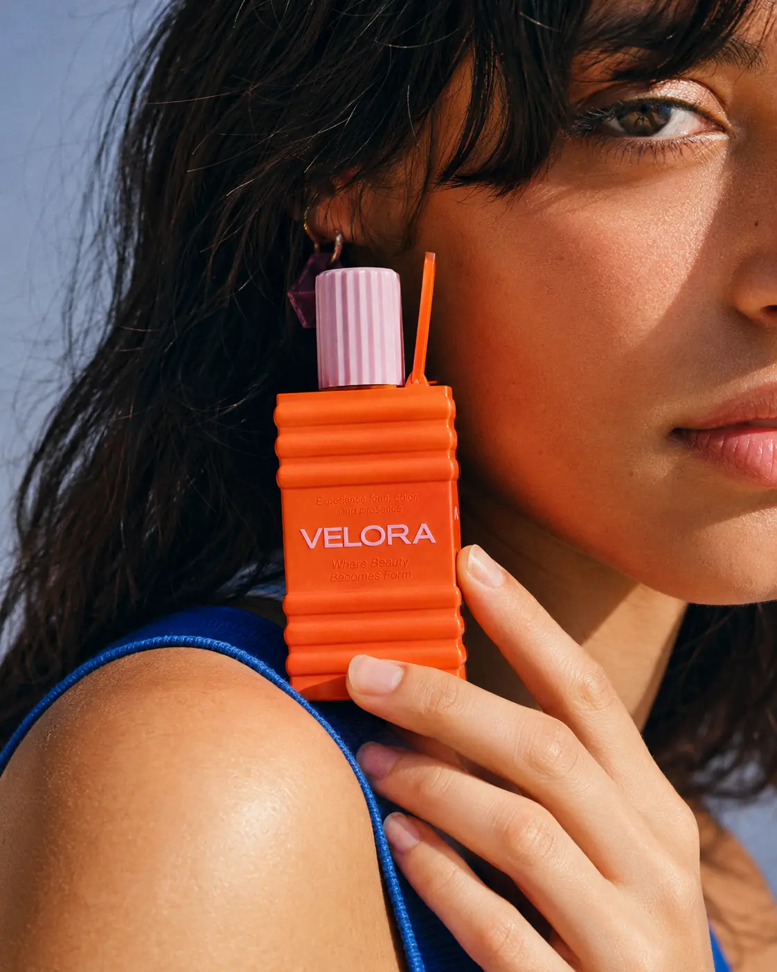
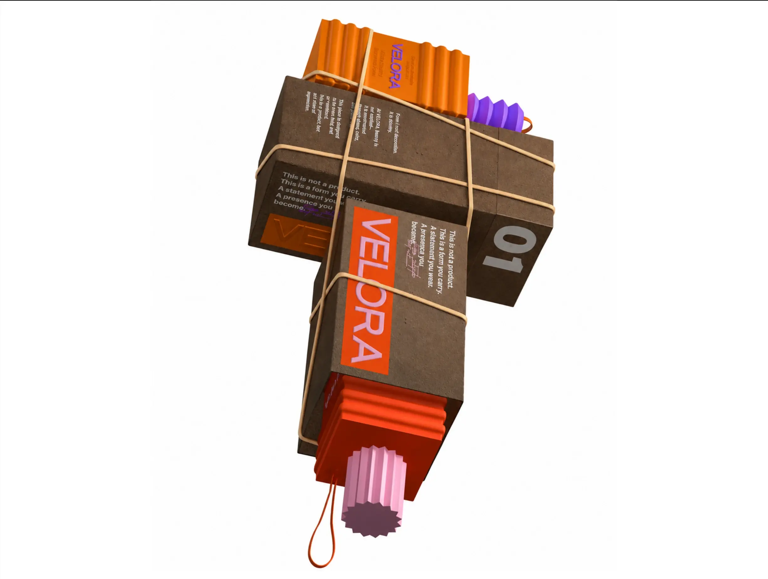
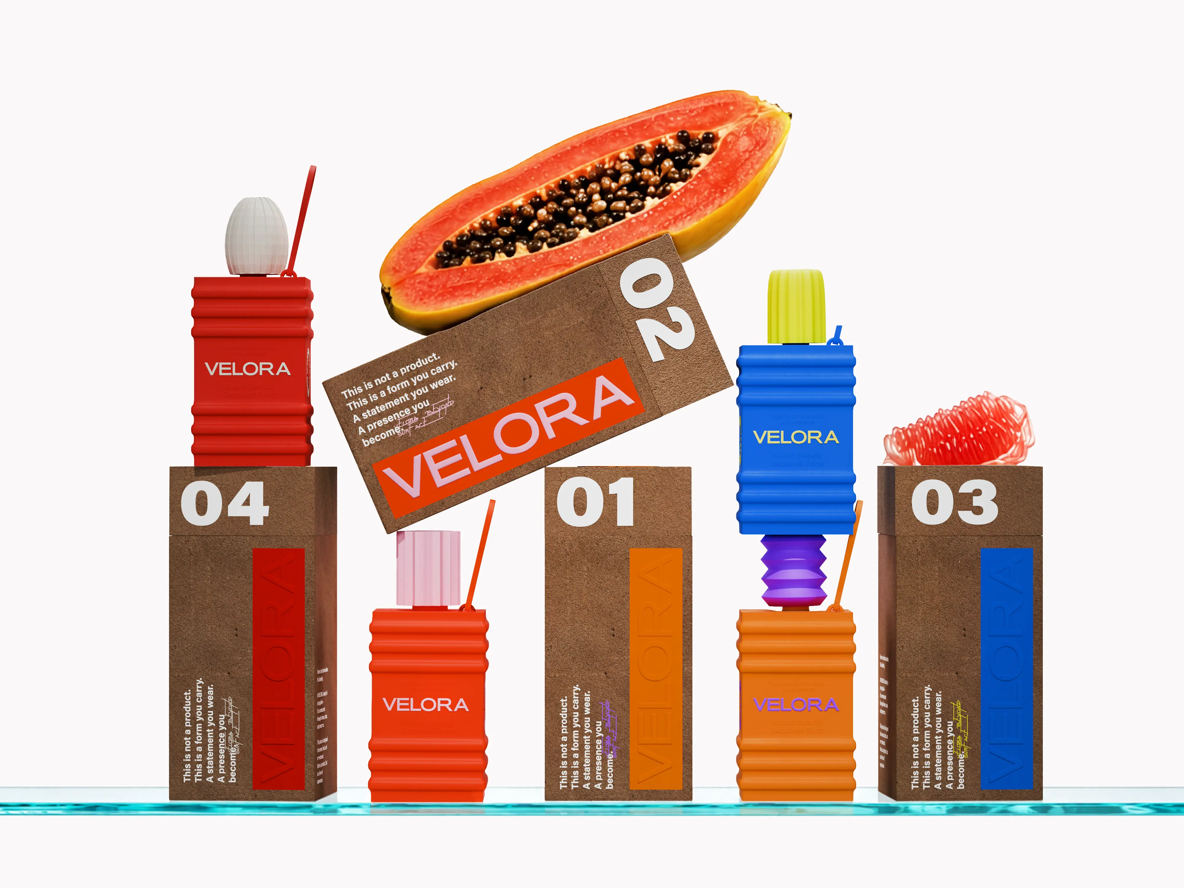
VELORA is a conceptual beauty brand built around the idea that packaging can perform far beyond its conventional role as a temporary container. Positioned at the intersection of beauty, object design, and conscious consumption, the brand treats every physical touchpoint as part of how it is perceived, used, and remembered. Rather than designing packaging to disappear after the product is finished, we approached each piece as a lasting object—collectible, refillable, reusable, and visually considered enough to remain within the user's personal environment. This idea became the foundation for a brand in which form, material, function, and identity operate as one continuous experience.
Strategy:
The strategy was built around shifting sustainability away from a secondary claim and embedding it directly into the behaviour of the product itself. Instead of asking users to value the packaging because it was described as sustainable, VELORA was designed to make the object worth keeping. Refillability, durability, tactility, and visual permanence therefore became central brand principles rather than technical afterthoughts. This positioning allowed the packaging to carry both practical and emotional value: something that performs efficiently in everyday use while gradually becoming part of the user's personal space. The result is a system where conscious consumption is expressed through longevity, interaction, and repeated use rather than through visual sustainability clichés.
Design:
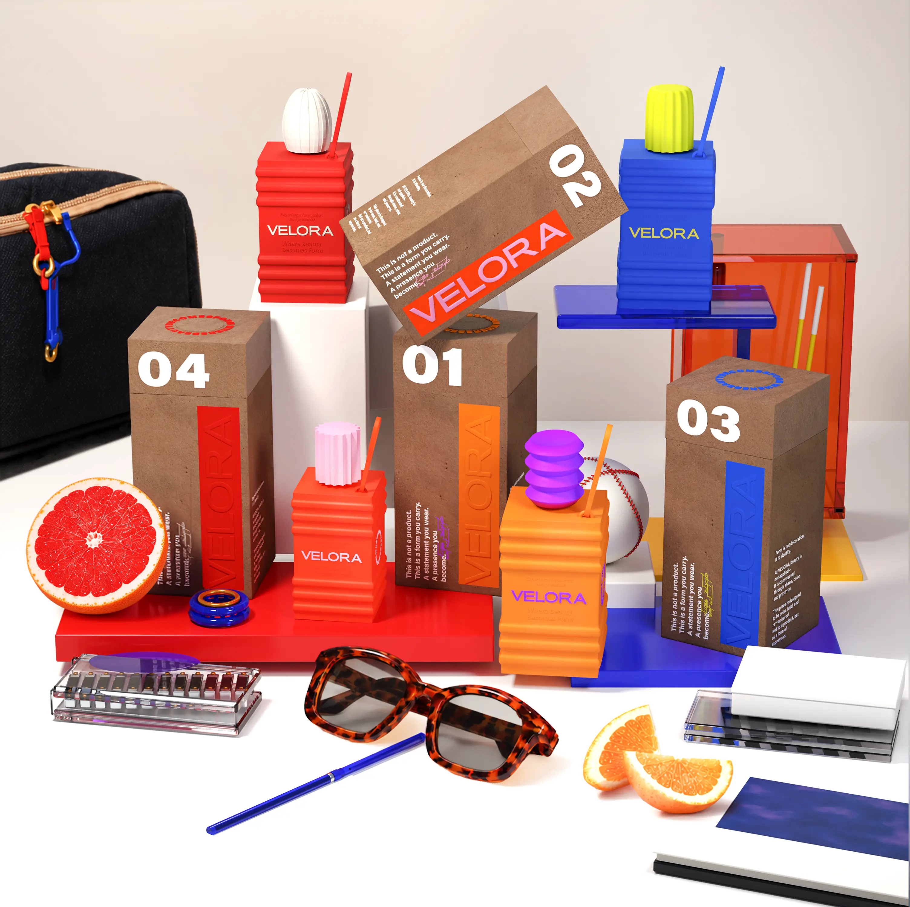
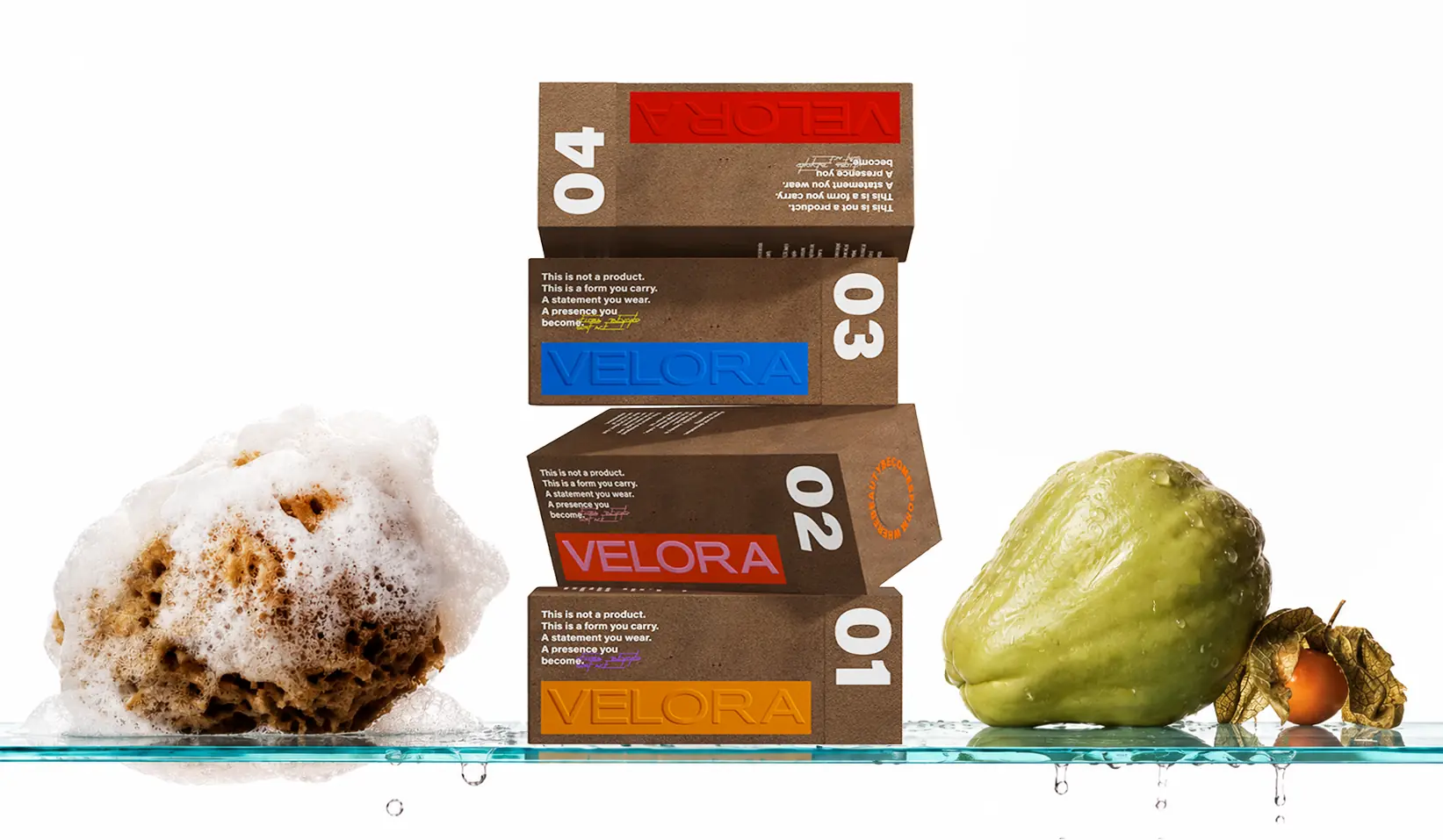
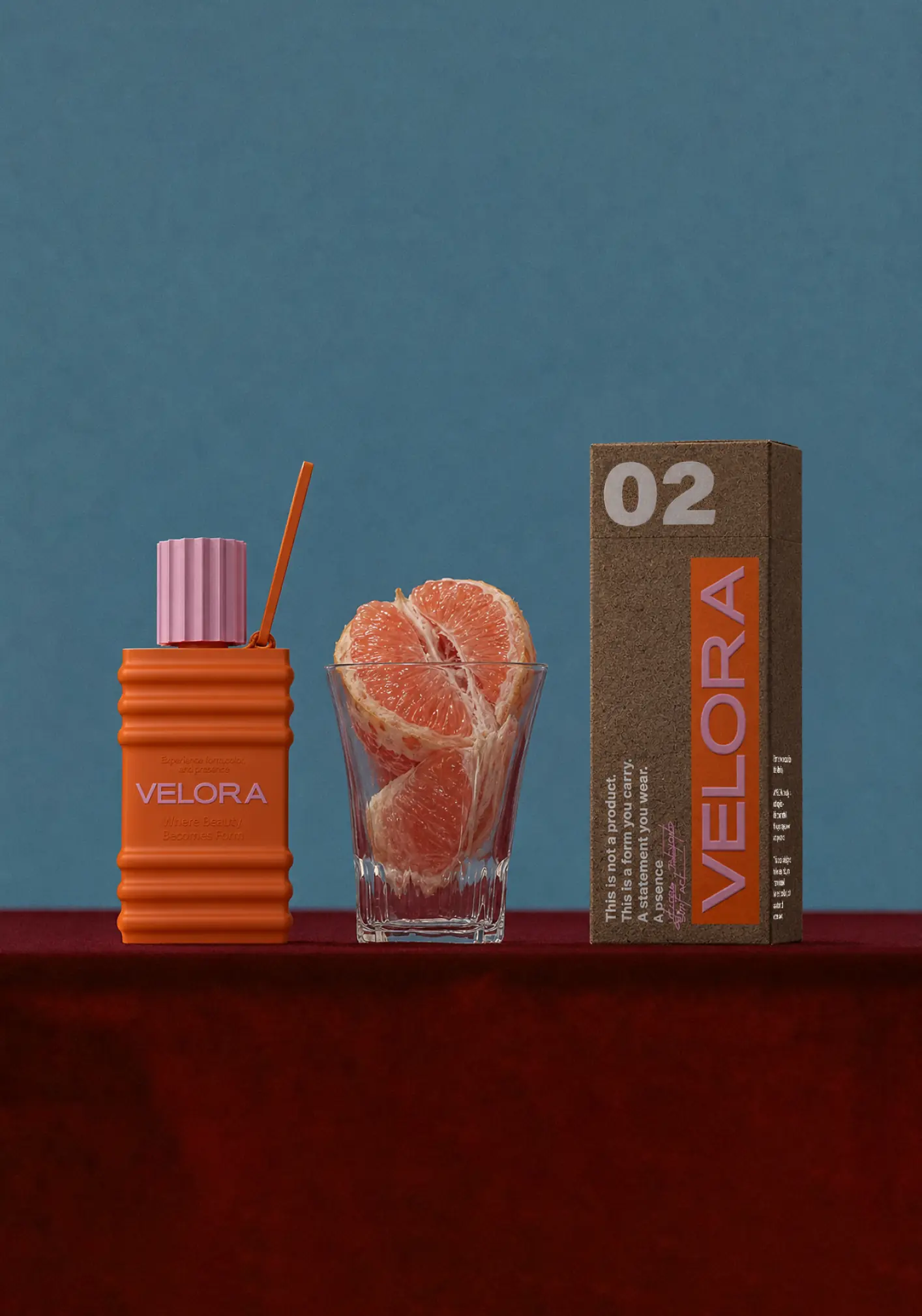
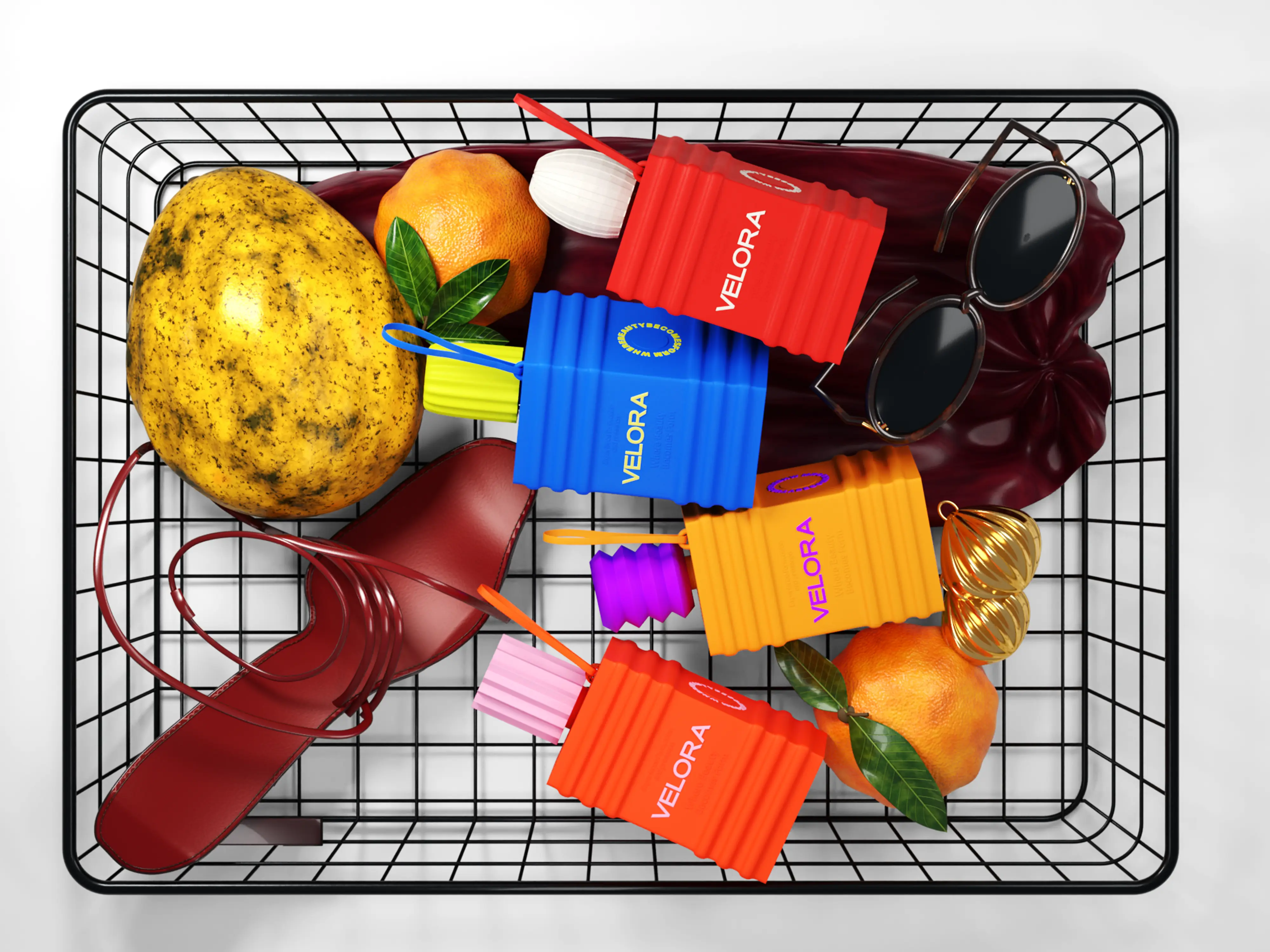
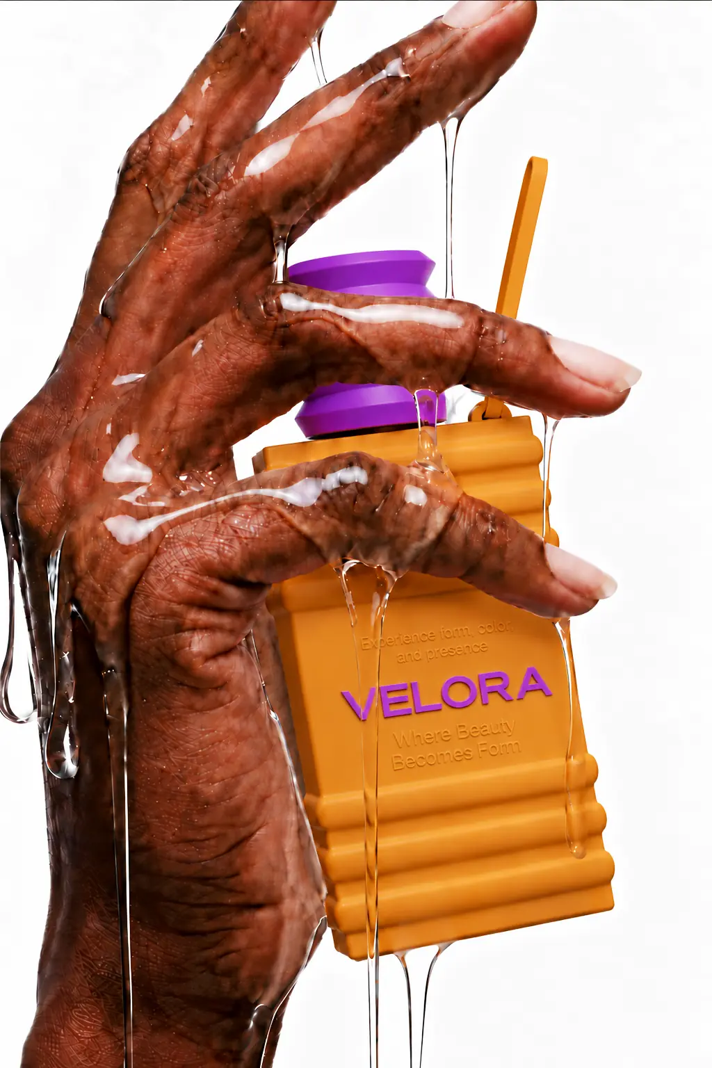
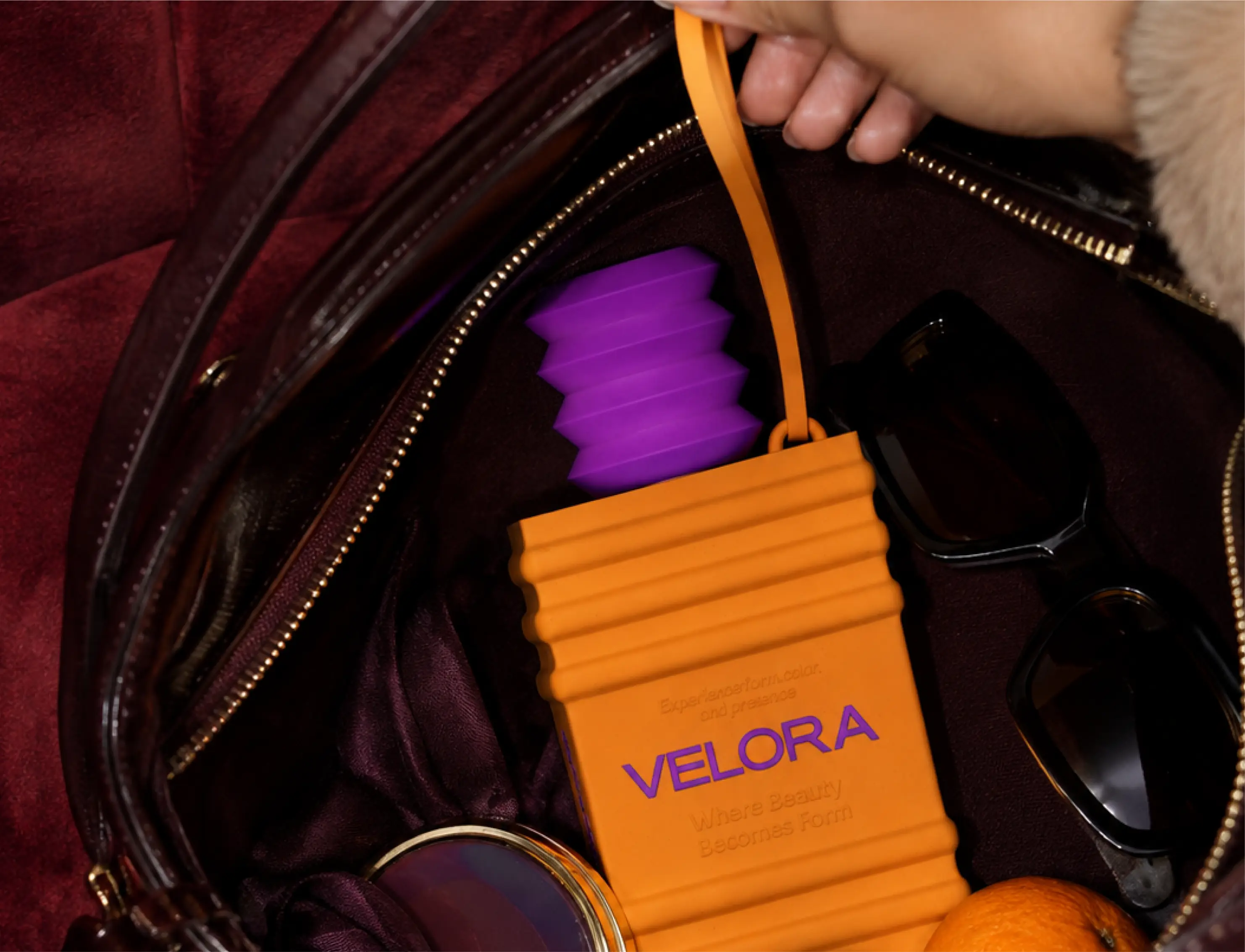
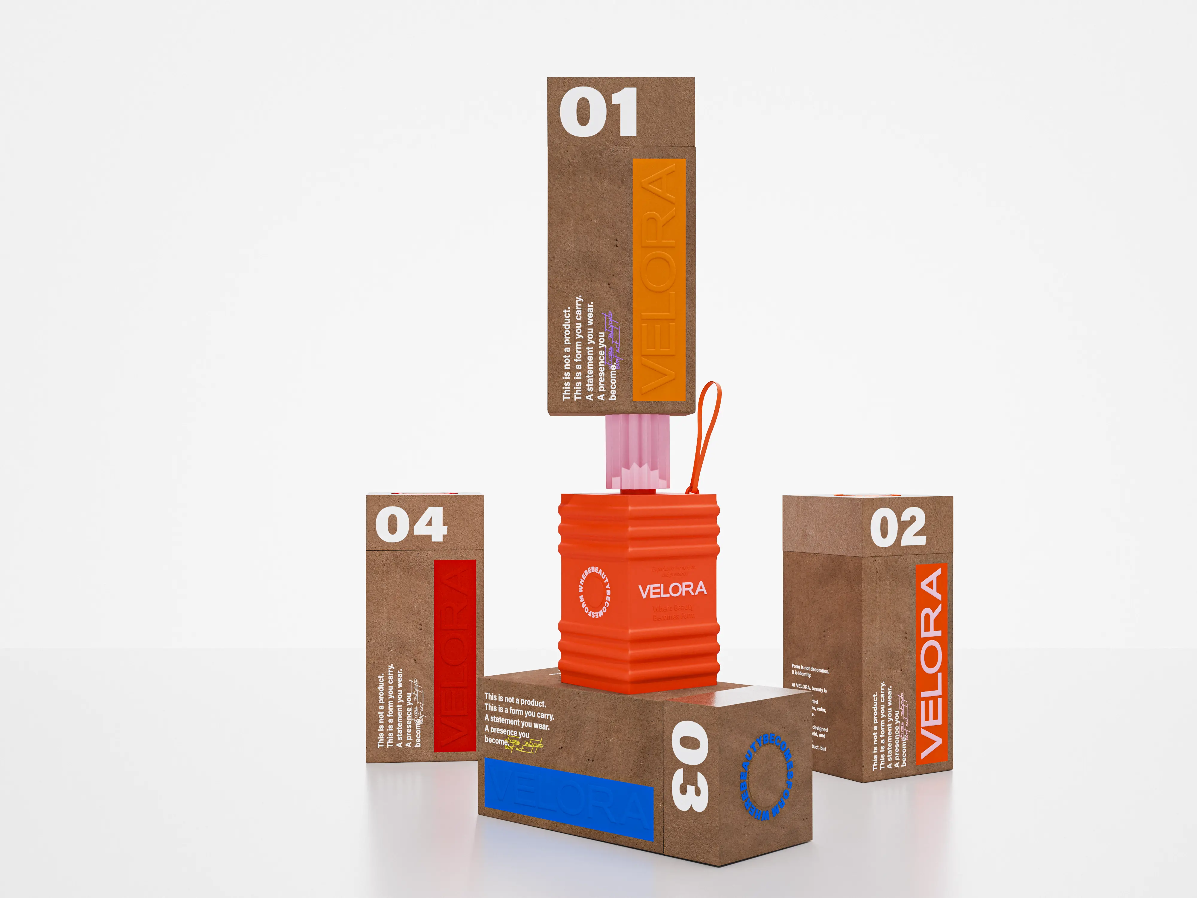
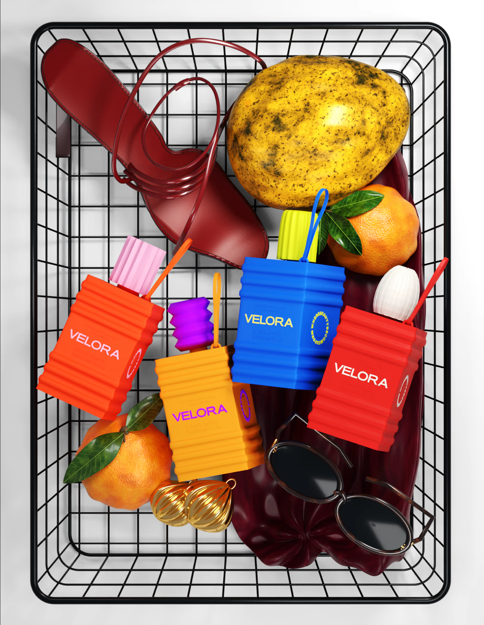
Each component was developed as an independent design object while remaining part of one recognisable family. Sculptural proportions and stepped, ribbed geometries give the range a distinctive silhouette while also improving grip and handling, allowing functional logic to emerge directly through form rather than applied decoration. Recyclable polymers, controlled wall thicknesses, precision moulding, and soft matte finishes were chosen for both technical performance and tactile character. Caps, closures, handles, surface transitions, and embossed typography were developed as parts of a unified construction language, bringing ergonomics, manufacturing logic, and branding into the same system. Colour adds another layer of distinction, giving individual products their own recognition value while the shared structural language keeps the collection visually coherent.
Problem & Result:
The challenge was to create beauty packaging that could feel collectible and visually distinctive without compromising everyday usability, manufacturing logic, or long-term relevance. At the same time, the brand needed to communicate a more conscious approach to consumption without relying on familiar visual sustainability codes. We solved this by making durability, refillability, tactility, and permanence part of the physical design itself. The result is a cohesive packaging architecture in which every object has its own character while remaining clearly part of VELORA: a system that transforms packaging from a disposable vessel into a lasting branded object designed to be kept, displayed, reused, and returned to over time.