ANIMO
Overview:
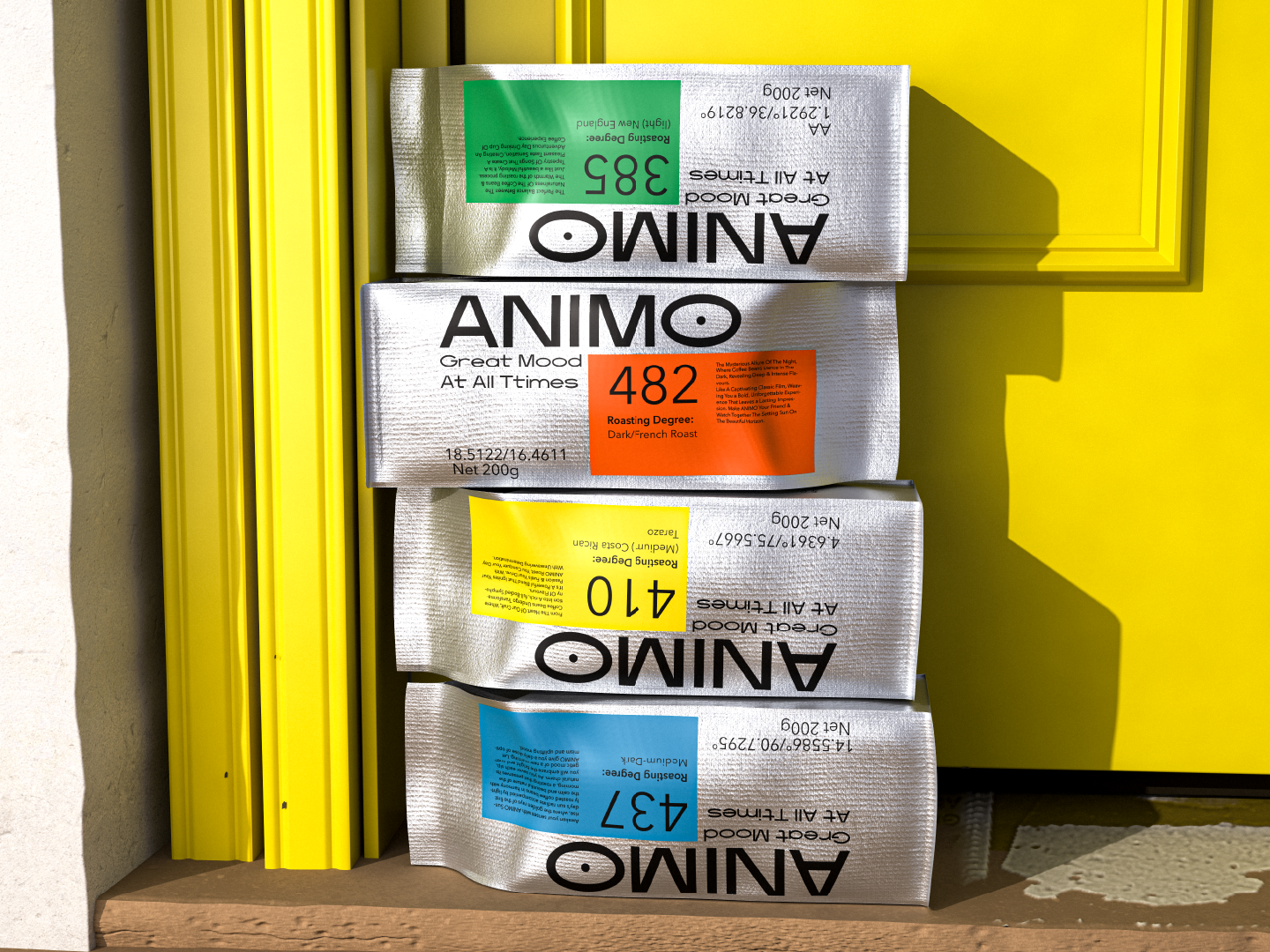
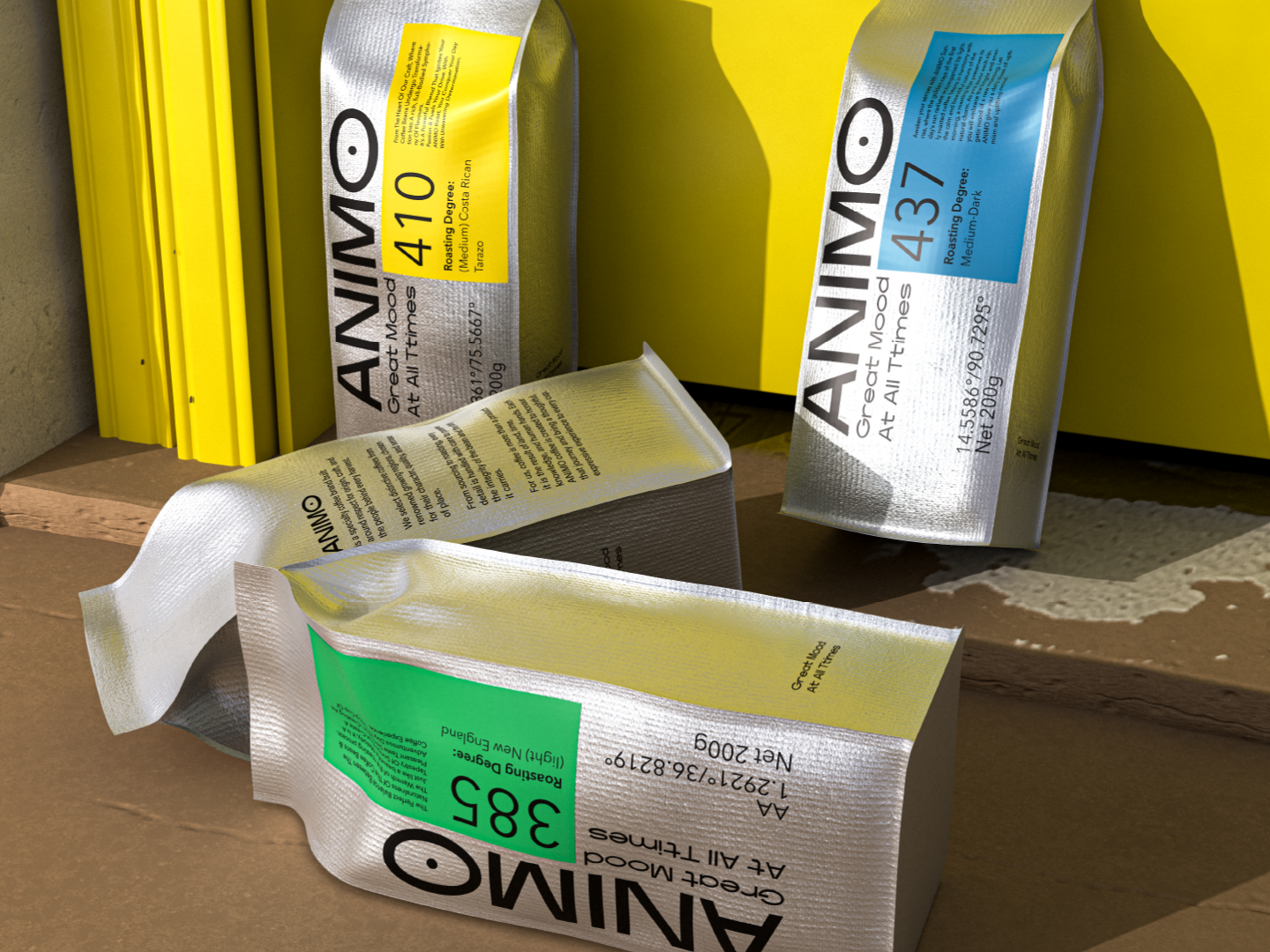
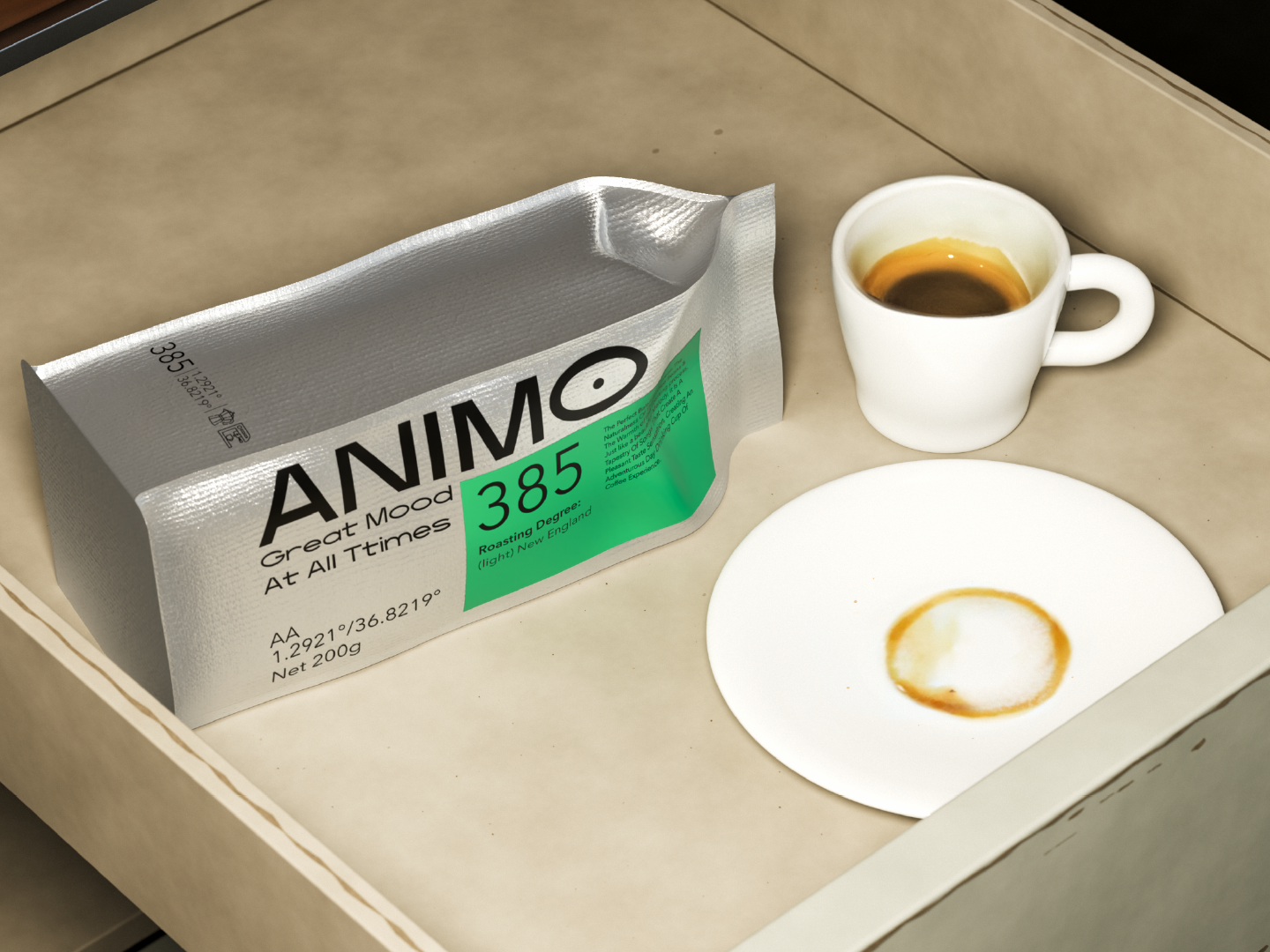
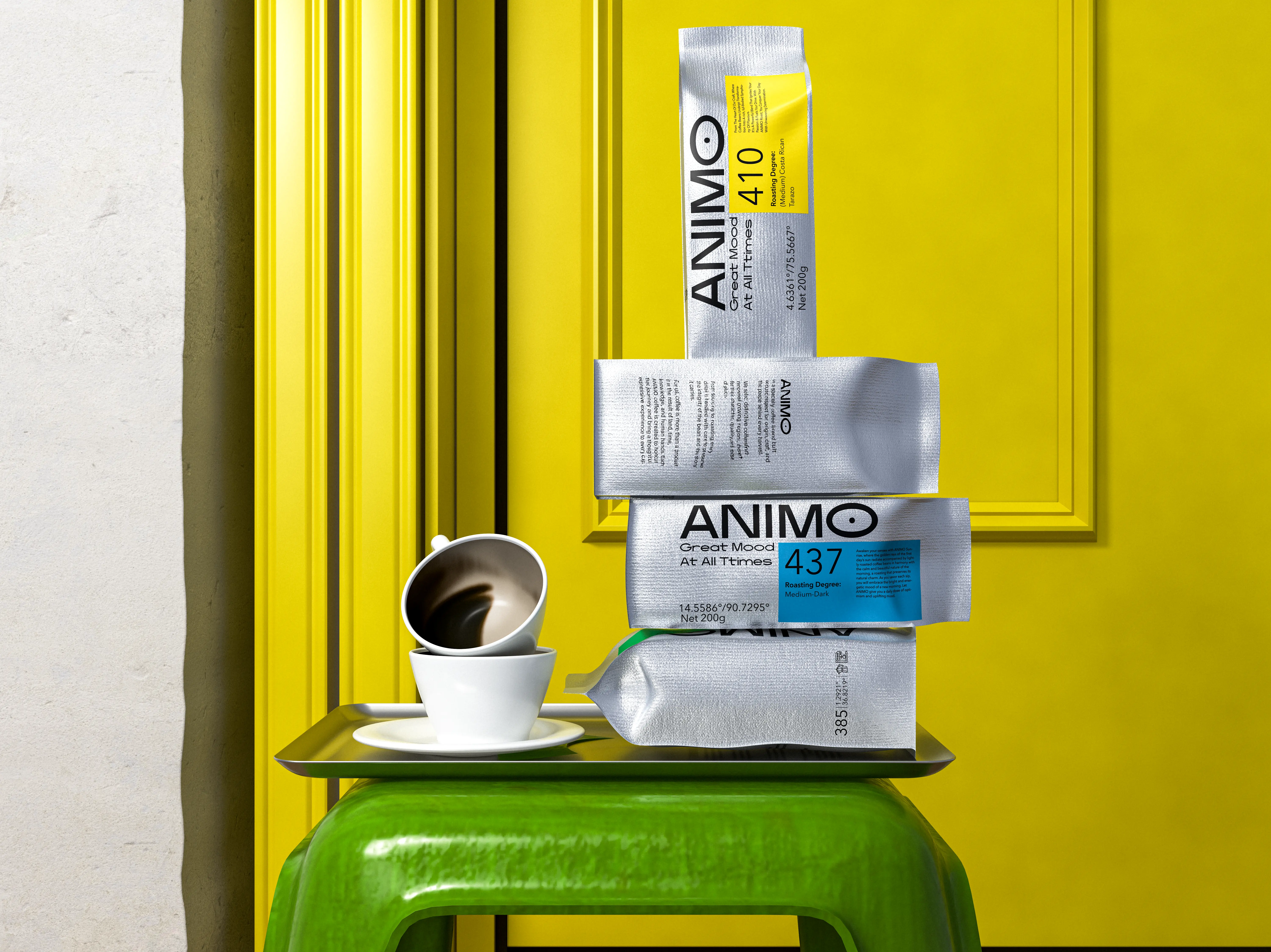
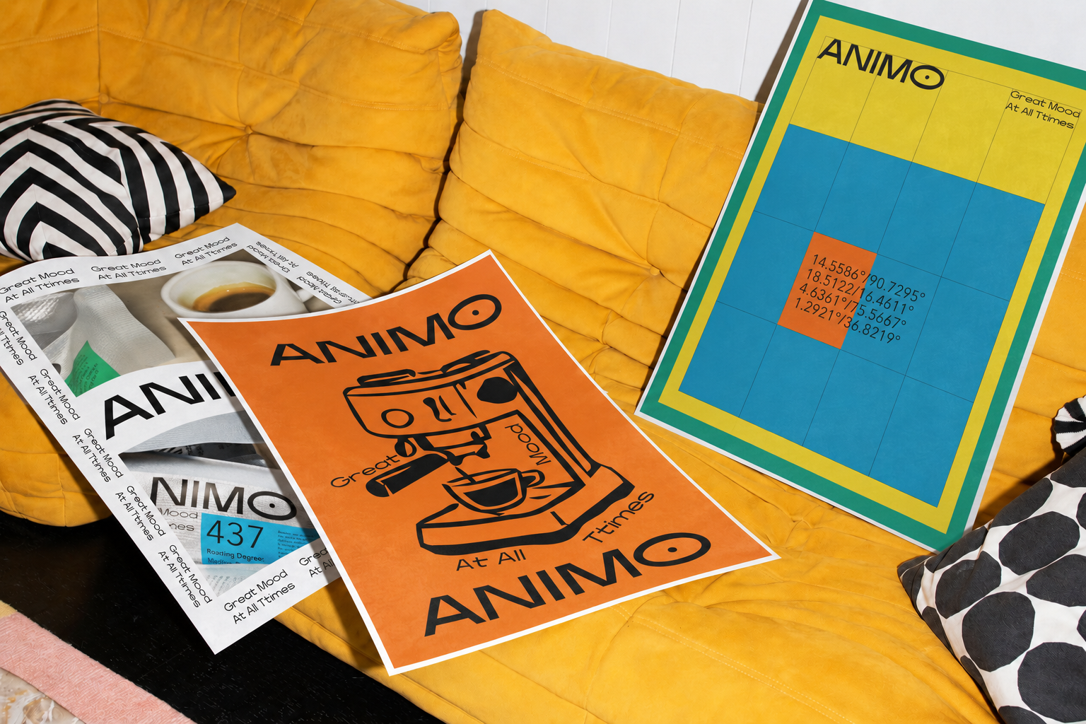
ANIMO is a specialty coffee brand built around four distinct varieties, each shaped by its origin, roast profile, and the kind of moment it is made for. Rather than treating coffee purely as a product category, the brand approaches it as part of an everyday ritual something tied to mood, place, memory, and personal preference. The identity was therefore developed to make each variety feel individual while remaining unmistakably part of one system. Packaging became the primary expression of this idea: a surface where origin, roast information, colour, typography, and storytelling could work together. The result is a collection designed to be understood quickly from a distance, yet rich enough in detail to reward closer attention.
Strategy:
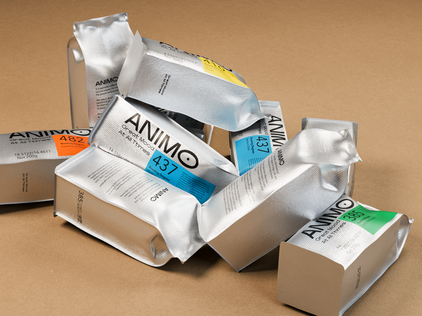
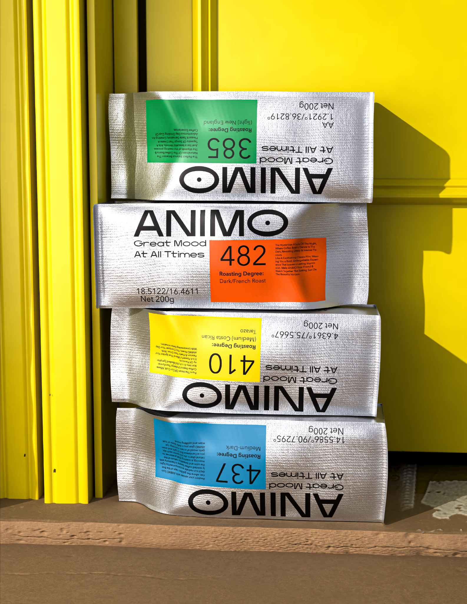
The strategic challenge was to give four different coffees meaningful distinction without allowing the range to fragment into four unrelated identities. We built the system around two complementary layers: functional information that helps people navigate the range, and emotional storytelling that gives each variety its own character. Origin, roast profile, numerical identifiers, and geographic references create a clear informational structure, while colour and narrative connect each coffee to a particular feeling and ritual. This allowed ANIMO to move beyond conventional origin-led coffee packaging and create a brand architecture capable of balancing expertise with accessibility. Each pack communicates what the coffee is, where its story begins, and the kind of experience it is designed to accompany.
Design:
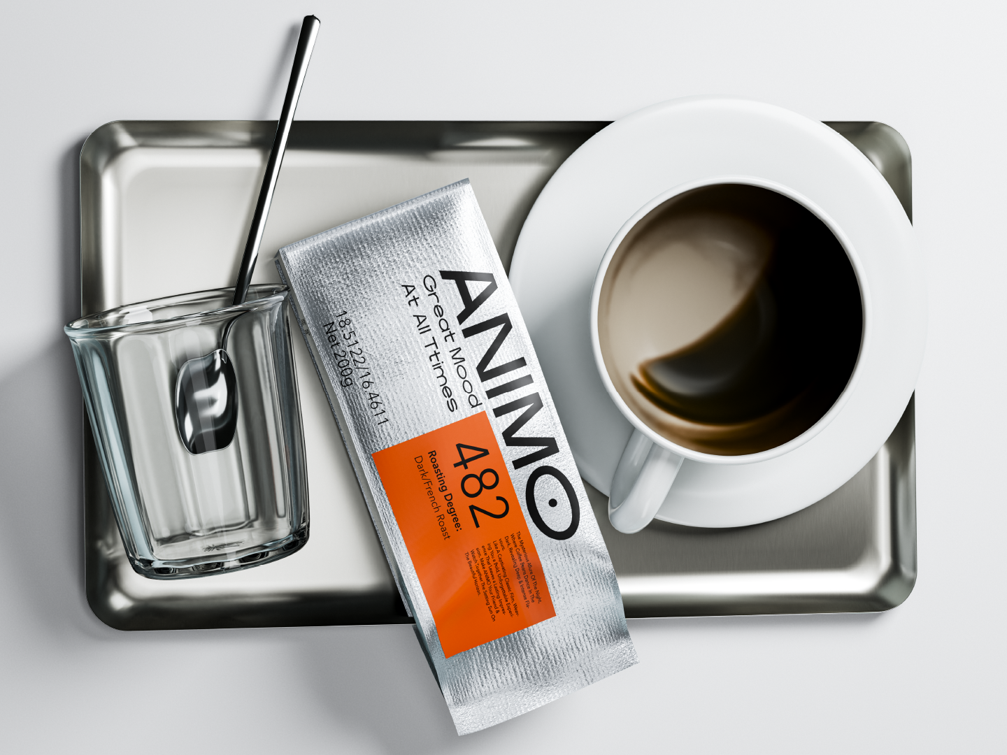
Packaging became the central design platform for ANIMO. A reflective silver substrate creates a consistent foundation across the collection, allowing vivid colour fields, black typography, symbols, and numerical elements to stand out with clarity. Each variety uses its own palette and visual cues while following the same underlying grid and hierarchy. Large numerical identifiers communicate roast information immediately, geographic coordinates reinforce the connection to place, and secondary storytelling gives each pack another layer of meaning beyond technical product information. Particular attention was given to proportion, spacing, information density, and the relationship between the ANIMO name, roast identifiers, origin details, and descriptive copy. The system is expressive without becoming decorative for its own sake; every element has a clear role within the pack.
Problem & Result:
The challenge was to give four coffee varieties distinct personalities while keeping the range immediately recognisable as one brand. Each pack also needed to communicate origin, roast profile, technical information, and storytelling without becoming visually crowded. We solved this through a shared packaging architecture built around a consistent grid, reflective silver base, clear typographic hierarchy, and a flexible system of colours, symbols, coordinates, and numerical identifiers. The result is a range that feels varied yet coherent: each coffee is easy to distinguish at a glance, while the underlying system keeps ANIMO recognisable across every SKU and provides a clear foundation for future additions.